9 Photo Editing Mistakes That Make Photos Look Fake
Avoid these 9 photo editing mistakes that make photos look fake, from plastic skin to HDR halos, plus quick fixes for natural edits on your phone or laptop.
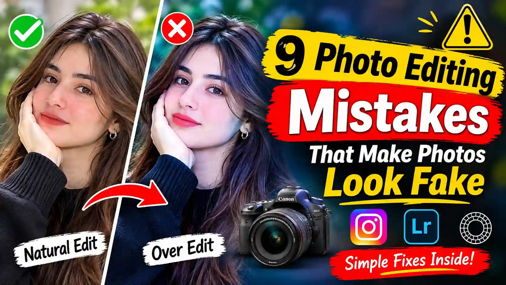
You post a selfie from a birthday dinner, and something about it feels off even though you spent ten minutes on it. Your skin looks smooth and the colours pop, yet your friends scroll past with a quiet "nice," and you can't work out why. Most of the time, the problem comes from common photo editing mistakes made in apps like Instagram, VSCO and Facetune. You're far from alone here, since a Pure Telecom survey found that 49% of people who share images online edit their selfies first. This guide covers the 9 photo editing mistakes that make photos look fake and shows you how to spot each one in seconds. For every mistake, you also get a simple fix for your phone, Lightroom or TryPhotoBooth.
[Image: Side-by-side selfie, natural edit on the left and heavy edit on the right. Alt text: before and after example of photo editing mistakes on a selfie]
9 Common Photo Editing Mistakes at a Glance
If you only have a minute, this table shows each mistake, the tell that gives it away, and the quickest fix.
| Mistake | The Tell | 10-Second Fix |
|---|---|---|
| 1. Faded blacks | Black hair looks grey | Pull back Fade |
| 2. One preset everywhere | Odd colours indoors | Halve preset strength |
| 3. Heavy grain | Grain before the face | Keep grain faint |
| 4. Too much saturation | Neon grass | Use vibrance |
| 5. Clarity and HDR | Halos, crunchy edges | Clarity at zero |
| 6. Ring vignette, fake blur | Dark donut, blurry hair | Soft vignette |
| 7. Teal shadows | Wrong shadow direction | Match the light |
| 8. Orange or plastic skin | No pores | Compare with eye whites |
| 9. Mixed strip edits | Frames don't match | Sync one edit |
Why Over Edited Photos Look Fake (Even When Nobody Tells You)
Over-edited photos look fake because real light, colour and skin all have limits. A real face has pores, real shadows fall in one direction, and real black is properly dark. When an edit pushes past those limits, your brain spots the gap before you can name it. So if you've ever asked yourself "why do my photos look fake?", the answer usually sits in one of the sliders below.
Even a royal photo can fall into this trap. On 10 March 2024, the Princess of Wales shared an edited Mother's Day picture. The Associated Press then withdrew it, saying "the source has manipulated the image." Reuters, AFP, Getty Images and EPA quickly sent their own kill notices. She later said she had "occasionally experimented with editing" (source). The story shows how fast people notice photo editing mistakes once trust is gone. It also explains why film photos feel more real than digital, since a Polaroid or a roll of Kodak Gold can only capture so much, and those limits are what make it believable.
Mistake 1: Lifting the Fade and Blacks Until Nothing Is Truly Dark
The fade slider is the first of our photo editing mistakes because it looks harmless. Lifting the blacks gives a soft, film-like feel, but pushing it too far turns every dark part of the photo grey. The image then loses depth, and it starts to look like a filter instead of a memory.
How to Spot Milky, Washed-Out Blacks
Look at anything in your photo that should be black, such as hair, a jacket, or the night sky. If those areas look like dusty grey, the fade is too strong. A quick squint test helps here. A well-edited photo still shows deep shadows when you squint, while a faded one looks flat and foggy.
How to Fix Faded Blacks on Your Phone or in Lightroom
Set the fade back to zero, then add it slowly until you just notice it. In VSCO, the Fade tool needs only a small nudge. In Snapseed, you can darken the shadows with the Tune Image tool. If you use Lightroom Mobile, drag the Blacks slider down a little or lift only the bottom of the tone curve. Then hold your phone at arm's length, because a photo that looks right from there usually looks right on Instagram. The Vintage filter in TryPhotoBooth already has a gentle fade built in, so you never need to add more.
Mistake 2: Using One Preset or Filter Stack on Every Photo
Presets save time, which is why so many photo editing mistakes start with them. A preset is built for one kind of light, so when you drop it on every photo, some come out perfect while others turn strange. Stacking several filters on top of each other makes the problem worse.
Why One Preset Can't Fit Every Light
A Lightroom preset made for a sunny beach day expects bright light and blue skies. Use it at a dim restaurant or a party under pink fairy lights, and skin can turn green. The preset isn't broken, but using it blindly is one of the quieter photo editing mistakes. Before you save, check three things: whether skin looks like skin, whether shadows still have detail, and whether white things look white.
Stacking Filters on Top of Filters
Many people add an Instagram filter on top of a VSCO preset that already sits on an iPhone Photos filter. Each layer pushes the colours a little further, and the result is muddy tones, crushed blacks, and skin that looks painted. One look is almost always cleaner than three looks fighting each other for attention.
How to Use Presets the Right Way
Pick one preset or filter and lower its strength to around half, which VSCO and Lightroom Mobile both allow. Next, adjust exposure and white balance for each photo, because no preset knows how bright your room was. This short step is the easiest way to make edited photos look natural instead of copy-and-paste. Our guide to photo booth filters explains when each film-style look works best.
Mistake 3: Adding Grain, Light Leaks and Vintage Effects at Full Strength
Real film grain is soft and quiet, so a heavy dose of digital grain is one of the most obvious photo editing mistakes. The same goes for light leaks, dust, and scratches added to every shot. When the effect shows up before the person does, the photo stops looking vintage and starts looking fake.
How to Spot Fake, Sandpaper Grain
Zoom in on a plain area like a wall or a cheek. If the grain looks like sandpaper or coloured static, it's too strong. Another giveaway is the same orange light leak in the same corner of every photo. Real leaks on a Kodak or Polaroid camera are random and rare, so a repeated leak tells everyone the effect came from an app.
How Much Grain to Add for a Real Film Look
Add grain at a low amount and keep it barely visible when you zoom to 100%. A medium grain size usually looks more like film than a tiny, sharp grain, and a little roughness stops it from looking like a pattern. Real scans of Kodak Gold or Kodak Portra make a good reference, since their grain blends into the image. Use one vintage effect at a time, so if you add grain, skip the dust and light leaks. For more on getting a retro feel without overdoing it, read our post on the Y2K photo booth aesthetic.
Mistake 4: Pushing Saturation Until Colours Glow
Saturation is the slider most people reach for first, and it causes some of the loudest photo editing mistakes. A small boost can make a sunset feel warm, but too much turns grass neon and skies cartoon blue. When one colour screams, and the others fade, the photo looks like a screen, not a moment.
How to Spot Over-Saturated and Neon Colours
Check the colours that rarely look bright in real life, such as grass, skin and blue jeans. If they glow, saturation is too high. Also watch for split colour from HSL tools, where one colour is pushed hard while the rest turn grey. That split ranks among the photo editing mistakes people spot right away.
Use Vibrance Instead of Saturation
Vibrance is the safer choice because it boosts dull colours more than bright ones and leaves skin tones mostly alone. In iPhone Photos, tap Edit and use Vibrance instead of Saturation. In Lightroom Mobile, the Color panel has both sliders, plus an HSL Mix tool where small moves of five or ten points are enough. Snapseed's Tune Image tool also has a gentle Saturation control that works well at low settings. When you finish, look at the skin last, since orange or red cheeks are the first sign that colour has gone too far.
Mistake 5: Overdoing Clarity, HDR and Sharpening
Clarity, HDR and sharpening all add detail, so they feel helpful at first. Pushed too far, they create grey halos, gritty skin and a crunchy look that reads as a video game. These photo editing mistakes are also common with AI-enhanced tools, which can quietly change faces, hands and text.
[Image: HDR halo around a person against the sky. Alt text: HDR halo, one of the photo editing mistakes that make photos look fake]
The "Render" Look: Halos, Crunchy Edges and Gritty Skin
On Reddit's r/carphotography, one user wrote, "I often got told my pictures look like renders after editing." That render look comes from heavy clarity and HDR, which add bright outlines around people, trees, and buildings. Watch for a glowing edge where a dark object meets a bright sky. Skin that looks like stone is another sign of photo editing mistakes with the detail sliders.
When AI Enhance and Upscaling Go Too Far
AI tools that promise to enhance or upscale a photo often guess at missing details. The result can be waxy faces, extra or bent fingers, oddly shaped teeth, and smeared letters on signs. Before you post, zoom in on hands, teeth, and any text. Those are the places where AI mistakes show up first. If you want to make AI photos look natural, keep the enhance strength low and fix any odd details by hand.
How to Fix Clarity and Sharpening
Keep clarity at zero on faces, or slightly negative for a softer look. Add sharpening as the very last step, and keep it light enough that you only notice it when zoomed in. Newer iPhones already apply Smart HDR and some sharpening, so a phone photo often needs less detail work than you think. TryPhotoBooth saves strips at 300 DPI, which means your prints stay sharp without any upscaling.
Mistake 6: Vignettes That Look Like a Ring and Fake Background Blur
A soft vignette pulls the eye to the centre, and a blurred background makes a person stand out. Both turn into photo editing mistakes when the effect is too strong or too sharp at the edges. Instead of looking like a real lens, the photo looks like someone painted on it.
How to Spot a Ring-Shaped Vignette
Look at the corners of your photo. If you see a clear dark ring or a donut shape around the subject, the vignette is too strong or its edge is too hard. Real camera lenses darken the corners gently and evenly, so a vignette that you notice before the face is doing more harm than good.
How to Spot Fake Blur and Cutout Halos
Portrait mode and blur apps cut the person out and blur everything behind them. When the cutout misses, you get blurry strands of hair, earrings that melt into the wall, and a sharp face floating in a smeared room. DIYPhotography called this out years ago with a simple point: faking bokeh with a basic blur usually just looks fake.
How to Add a Vignette and Blur That Look Real
Keep the vignette amount low and the feather high, so the darkening fades in smoothly. In Lightroom Mobile, a radial filter around the face gives more control than a global vignette. For real background blur, step a few feet away from the wall, since distance creates natural depth that no app can copy perfectly. In TryPhotoBooth, a plain backdrop works even better, because a clean wall or sheet keeps attention on your faces without any blur.
Mistake 7: Teal Shadows and Light That Doesn't Match
Colour grading can give a photo mood, but turning every shadow teal is one of the photo editing mistakes that screams "filter." Light that doesn't match is even worse. Shadows that point the wrong way break the most basic rule of a real scene, and people notice it even when they can't explain why.
Why Orange-and-Teal Grading Looks Like a Filter
The orange-and-teal look comes from Hollywood movie posters, where skin is pushed warm, and shadows are pushed cool. Real film like Kodak Gold doesn't turn every shadow blue-green, so this look rarely fits a birthday party or a family picnic. Over-edited family photos often get this treatment, and a picnic that looks like a blockbuster trailer feels staged right away.
Shadows Pointing the Wrong Way
A face lit from the left with the sun clearly on the right is a dead giveaway. On Reddit's r/AskPhotography, one popular thread pointed out that a photo felt edited because the shadows didn't line up with the background. Sky replacement tools cause the same issue when a bright sunset sits behind people lit by grey light.
How to Grade Shadows and Match Light
If you tint shadows, keep it small enough that you only see it next to the original. Light on faces should come from the same side as the light in the background. It's also best to skip sky swaps on photos with people in them. The easiest fix starts before the edit, so face a window or use a ring light. Our guide to light in photography explains this in more detail.
Mistake 8: Orange Skin and Over-Retouched Faces
Faces are where people notice edits most, which makes them home to the most damaging photo editing mistakes. Too much warmth turns skin orange, and too much retouching turns it into plastic. Whitened teeth, glowing eyes, and liquify tools add to the problem quickly.
[Image: Over-smoothed skin next to natural texture. Alt text: plastic skin, a common photo editing mistake on selfies]
Over-Warming Until Skin Turns Orange
Warming a photo can fake a golden-hour glow, but pushed too far it makes skin look orange or sunburnt. A simple check is to compare skin with a white shirt or the whites of the eyes. If those look yellow too, pull the temperature back. Real golden light is softer than any slider, as we explain in the truth about golden hour photography.
Plastic Skin From Heavy Smoothing
Smoothing tools in Facetune or a phone's beauty mode can remove every pore. The result is a blurry face next to sharp hair and eyelashes, which looks like a wax figure. Keep the strength low and heal only blemishes, so the skin keeps its texture. Heavy smoothing is one of the photo editing mistakes people notice first on a close-up selfie.
Glow-White Teeth and "Lit-Up" Eyes
Teeth should never be whiter than the whites of the eyes. When they are, or when eyes look brighter than the light in the room, the face starts to look like an AR filter. Small changes are fine, but stop as soon as you notice them.
Liquify Warps: Bent Doors and Wavy Walls
Liquify and reshape tools move pixels, so they also bend anything near the face or body. Look at door frames, tiles, railings, and horizons near the edit. A curved line that should be straight is one of the photo editing mistakes that gives a selfie away instantly.
How to Retouch a Face and Keep It Real
Fix temporary things like a spot or a stray hair, and leave the features that make a face yours. Before you save, zoom out to the size people will see on Instagram or TikTok. For a playful look, try the AR lenses in TryPhotoBooth, like dog ears, a crown, or sunglasses. They add fun without changing your face at all.
Mistake 9: Different Edits on Every Frame of a Photo Strip
A photo strip shows several frames side by side, so even small photo editing mistakes stand out. If one frame is warm, the next is cool, and the last is bright, the strip looks messy instead of like one fun moment. The fix is simple once you know where the problem starts.
[Image: TryPhotoBooth Korean 4-cut strip with one filter. Alt text: consistent photo strip that avoids photo editing mistakes]
Why a Photo Strip Shows Editing Mistakes Faster
In a Korean 4-cut strip or a classic 3-pose strip, your eye jumps from frame to frame and compares them. Life Four Cut booths look so clean because each frame shares the same light and colour. A single frame with a different edit breaks that rhythm right away, so the whole strip feels less real.
How to Keep a Photo Strip Consistent
Edit one frame until you're happy, then copy those settings to the others with Lightroom's sync tool or VSCO's copy and paste edits. After that, only adjust exposure if one frame is darker than the rest. On TryPhotoBooth, the easiest method is to choose one filter before you start shooting, so every frame gets the same look. You can explore all the strip options in our guide to photo booth layouts and frames.
How to Tell if a Photo Is Over Edited: A 10-Second Check
You can tell if a photo is over edited by checking a few spots that edits almost always change. On Quora, one question with 81 answers asks, "How do I tell if a picture has been edited?" This quick list answers it for your own photos and anyone else's, so you can catch photo editing mistakes before you post.
- Skin: look for pores and texture, since skin that looks like plastic has been smoothed.
- Teeth and eyes: compare teeth with the eye whites, because teeth should never be brighter.
- Straight lines: check door frames and walls near faces for bends.
- Shadows: make sure light on faces matches light in the background.
- Edges: zoom in on hair and earrings for blur or halos.
- Colours: compare grass, skin and sky with how they look in real life.
- Small size: view the photo as a thumbnail, where heavy photo editing mistakes show up as odd colours.
How to Avoid Over Editing Photos: The One Rule Behind All 9 Mistakes
The best way to avoid over-editing photos is to follow one rule. If you notice the edit before you notice the person, it's too much. Every mistake in this guide breaks that rule in a different way, whether through colour, texture, light or shape.
To follow it, finish your edit and then put your phone down for a few minutes. When you come back, compare the edited photo with the original side by side, and pull back any slider that jumps out at you. It also helps to start with a better photo, because good light from a window or ring light means you need fewer changes later. Most photo editing mistakes happen when we try to save a weak photo with strong sliders. That's how to edit photos naturally: keep your edits small, match real light, and your photos will look like you on a good day.
Get the Film Look Without Fighting the Sliders
A natural photo comes from good light, a clear moment, and one gentle look, not ten stacked effects. Once you know these photo editing mistakes, you'll spot them in your feed and in your own camera roll. The simplest shortcut is to start with a photo booth strip instead of a heavily edited selfie. On TryPhotoBooth, you can take a Korean 4-cut or classic 3-pose strip right in your browser. Pick one film-style filter and save it free, with no signup and no watermark. Try a strip with friends this weekend at our free online photo booth and see how real a light touch can look.
Frequently Asked Questions
Why do my edited photos look fake?
Edited photos usually look fake because colour, light and texture no longer match real life. On Reddit's r/photoshop, a thread with this exact question got the top answer "Colour and light are off." Lower saturation, clarity, and smoothing, and check that shadows fall the same way.
Why do my iPhone photos look fake even without editing?
Newer iPhones use Smart HDR and automatic sharpening, which can make skin look smooth and edges look crisp. Try shooting in softer light and turn off extra filters. If your model supports Photographic Styles, pick a less punchy style for a more natural, true-to-life look in every shot.
How can you tell if a photo is edited?
Look at skin texture, teeth compared with the eye whites, bent lines near faces, and shadows that point the wrong way. Zoom in on hair and earrings for blurry halos. These clues catch most photo editing mistakes within ten seconds, even on a small phone screen.
How much grain should I add for a film look?
Add only enough grain that you notice it at 100% zoom but not at normal size. In VSCO or Lightroom Mobile, a low amount with a medium size works well. Skip extra dust or light leaks, since stacking effects is how most grain-related photo editing mistakes begin.
Should every photo in a photo strip get the same edit?
Yes, because the frames sit side by side and any colour change stands out right away. Edit one frame, sync the settings to all of them, and then adjust only exposure where needed. This keeps the strip looking like one moment.
Is it wrong to edit selfies before posting?
No, editing is normal, and almost half of people who share photos do it. A recent Facebook post asked where the line is between editing and faking. A good rule is to fix light and colour freely but leave your face and body shape alone, which avoids the worst photo editing mistakes.
Keep Reading
If this guide helped you fix your photo editing mistakes, there's more to read. Our posts on film vs digital photos, Polaroid photography for beginners, and photo booth lighting are good next steps.
Ready to try this in your browser?
Launch our free 3D studio, test out vintage filters, and save your photo strip instantly.