Photo Composition Rules: What Every Tutorial Gets Wrong
Discover the truth about photo composition rules, from the rule of thirds to centered portraits. Learn simple photography tips and when to break the rules for better selfies and photo booth strips.
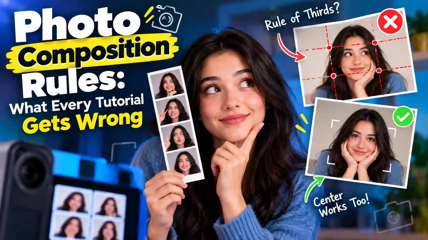
Open any photography tutorial, and the same tip shows up near the top. You split the frame into a 3x3 grid and put your subject on a line. Most guides to photo composition rules repeat that advice word for word, as if it were carved in stone. The real story is stranger and far more useful. The rule of thirds began as a painting tip in a 1797 book about country views. Modern lab tests later found that it barely predicts which pictures people like. That does not make the rule useless, but it does mean you should know where each tip came from. This guide checks the photo composition rules that every tutorial repeats against history and research. Then it turns each one into a simple fix for selfies and photo booth strips you can try on TryPhotoBooth, our free online photo booth.
Photo Composition Rules: What's Taught vs. What Actually Works
Photo composition rules are rules of thumb, not laws. They describe patterns that often show up in good pictures, like a subject placed off-center or a line that leads the eye. They are handy starting points for beginners, but no rule can promise a good photo.
So why does every guide sound the same? Most tutorials are written by reading other tutorials. A writer checks the top pages on Google and finds the rule of thirds, leading lines and the golden ratio. Then the same list goes up again with new pictures. Over time, a soft tip hardens into a law just because people repeat it so often. That is how common photo composition mistakes get passed along as expert advice. Few guides to photo composition rules link to a single study, and almost none explain where the rules came from. Even Adobe's own guide quotes a photographer who says, "It's not really a rule. It's more of a guideline." That honest line gets lost each time the same composition rules in photography are copied again.
Where the Rule of Thirds Really Came From
The phrase "rule of thirds" was first written down by John Thomas Smith in 1797. It appeared in his book Remarks on Rural Scenery, according to Wikipedia's history of the rule. Smith was writing about painted country views, and he leaned on 1783 notes by Sir Joshua Reynolds about balancing light and dark. His idea was about proportion rather than a grid. He suggested "the ratio of about two thirds to one third," such as two parts land to one part sky. His version had no lines, no nine boxes and no "power points." The tidy grid on your phone came much later, long after the first photo composition rules were written. People pushed back early, too. In 1845, George Field wrote in his book Chromatics that the rule "does not supply a general law." In plain words, Field felt that one useful case was being sold as a law for every picture.
What Studies Actually Say About These Rules
Scientists have tested the grid, and the results are humbling. In 2014, a team led by Seyed Ali Amirshahi and Christoph Redies studied large sets of photos and paintings. Their paper in Art & Perception found that ratings "correlated only weakly" with the rule when people judged it by eye. When a computer measured the rule, the link disappeared completely. The team concluded that the rule plays "only a minor, if any, role" in high-quality images.
A 2022 study in PLoS One by Justin Wang, Marie Lee and Thomas Lee came at it from another side. They found that many high-quality photos "successfully break the common photographic rules" by putting the subject in the center. So the research does not say photo composition rules are wrong. It says they are one tool among many, and strong photographers break photo composition rules all the time.
10 Composition Myths and the Real Fix (Quick Table)
Here are ten photo composition rules and myths that tutorials keep teaching, with the evidence and a quick booth fix.
| Myth | What's true | Booth fix |
|---|---|---|
| Thirds is a timeless grid law | It began in 1797 as a ratio | Use a two-to-one background split |
| Thirds is a simple golden ratio | Little evidence for that | Use the phone grid |
| Golden ratio looks better | Claims are dubious fits | Skip the spiral |
| Never center your subject | Top photos often do (Wang 2022) | Center each 4-cut face |
| The rule makes photos pleasing | Ratings barely matched (Amirshahi 2014) | Judge the whole strip |
| Eyes go to intersections | No cited study shows this | Eyes on the top line |
| Rules are made to be broken | Break them with a reason | Prop off to one side |
| Leave lead room | True, studies support it | Leave space where you look |
| Landscape rules fit selfies | Booth cells are tall and tight | Eyes one-third down |
| Composition fixes bad photos | Light comes first | Face the light |
The Rule of Thirds: What It Actually Does
The rule of thirds pushes your subject away from the dead center of the frame. That shift adds a little tension and makes the eye travel around the picture. Wikipedia sums up its purpose well: the rule exists "to discourage placement of the subject at the center." That is helpful for beginners, because most first photos put a face in the exact middle under a lot of empty wall. Moving the subject to one side makes you notice what else is in the frame. The rule of thirds works for so many people because it gives you a quick check before you shoot. That is why it tops every list of photography composition rules for beginners. Of all the photo composition rules, it is the best training wheels for your eye. The mistake is treating it as the goal.
Use Your Phone's Grid the Right Way
Your phone already has the grid built in, so turn it on first. On an iPhone, open Settings, tap Camera and switch on Grid. Most Android phones have a grid lines switch in the camera app's settings. Once the lines appear, put the eyes on the top line instead of hunting for "power points." Digital Photography School says "studies show" that eyes go to those crossing points. However, the guide cites no study, and we could not find one either. The eye line is the easiest win in phone photography composition and the most useful of these photo composition rules.
Centered Composition: When the Middle Wins
Centered composition works best when a face looks straight at the camera or a scene is balanced on both sides. The 2022 PLoS One study found this kind of rule-breaking in many high-quality photos. Those centered shots often kept other details on the thirds lines. When two eyes, a nose and a smile sit in the middle, the face feels calm and direct. That is why so many Instagram and TikTok profile pictures place the face right in the center. In a photo booth, centering often beats the usual photo composition rules. Each cell in Layout B, the Korean 4-cut strip, is a small vertical box. A face pushed to one side can look cut off there. So center your face in each cell, and let a prop or a sign sit off to one side.
Rule of Thirds for Selfies and Photo Booth Shots
A rule of thirds selfie works best when you use the grid for height rather than side placement. Hold your phone at arm's length, a little above eye level. Then place your eyes near the top grid line, which keeps your headroom small. On a laptop, raise the screen until the webcam sits level with your eyes. A stack of books works fine for this, and it also keeps the camera steady. When the camera looks up at you, the frame fills with chin and ceiling. If friends join in, use the TryPhotoBooth homepage tip: "Leave room for friends and face a good light source." Step back half a pace and check the preview before the countdown ends. Our guide to using a photo booth on a laptop covers webcam setup step by step, so these photo composition rules work on any laptop.
Is the Golden Ratio Better Than the Rule of Thirds?
No, and you can safely skip it. Golden ratio photography uses a number near 1.618 to place lines slightly closer to the center. It is often drawn as a curling Fibonacci spiral over the photo. Many tutorials call the rule of thirds a simple version of it. Yet Wikipedia's page on composition says there is "little evidence to support this claim." The golden ratio still has a loyal fan club. Le Corbusier and Salvador Dalí shaped some of their work around it because they found it pleasing. Even so, many claims about the ratio rest on what Wikipedia's golden ratio page calls "dubious fits to data." If you draw a spiral on almost any photo, you can make it seem to fit. For a selfie or a photo strip, the spiral adds work without adding value. Your phone's grid and a good eye will beat photo composition rules built on one famous number.
Leading Lines: Why Your Eye Follows Them
Leading lines are lines in a scene that pull your eye toward the subject. A road, a fence, a row of lights or a table edge all work this way. The eye tends to follow a clear line until it reaches something interesting. That simple idea is why leading lines photography appears in nearly every beginner guide. The part tutorials skip is direction. A line only helps when it points at your subject. If it runs out of the frame, it carries the viewer's eye out with it. A line that cuts through someone's neck can also feel awkward, so watch where each line lands. Before you shoot, trace the strongest line on your screen with a finger. If it ends at a face, keep the shot. If it ends at the edge, step left or right. That small check matters more than most photo composition rules.
Easy Leading Lines at Home and at Parties
You do not need a city street to find leading lines. A hallway gives you two walls that meet behind you. String lights hung in a V shape point straight down at the people in the middle. A party table, a stair rail or a striped backdrop all do the same job. For a birthday or graduation, tape angled ribbon on the wall behind your laptop and stand where it meets. Layout A then gives you three shots to test the lines, so you can apply photo composition rules at home.
Framing: The Rule Most Guides Skip
Framing means using something in the scene to put a border around your subject. Plenty of guides list framing next to the rule of thirds and never explain it. The idea is simple. A doorway, a window, an arch or a friend's arms can form a second frame inside the photo. That inner frame tells the viewer where to look and adds depth. A Polaroid print does something similar with its thick white border, which helps those photos feel cozy. In TryPhotoBooth, the 100+ frame colors act as a built-in frame around every shot. A soft pink frame feels sweet, while a black frame makes bright faces pop. Among all the photo composition rules, framing is the easiest to fake in a booth. Pick a frame color that contrasts with your background, and your subject will stand out.
Negative Space: The Most Misread Tool
Negative space is the empty area around your subject, and its real job is to give that subject weight. Most tutorials say "leave space" and stop there. That is why so many people end up with tiny faces lost on a big wall. Empty space only works when it has a clear purpose. A single person against a plain sky looks calm because the space around them tells that story. A cluttered shelf behind you does the opposite, because every object fights for attention. Print size changes the math as well. A small figure can hold its own on a big poster. On a 2x6-inch photo strip, the same figure shrinks into a speck. If you print strips at home, our guide to photo paper for printing at home helps small faces stay crisp. So booth photos need less negative space than landscape-style photo composition rules suggest. Fill most of each cell with faces, and keep a plain wall behind you. A curtain, a painted wall or a plain bedsheet all work well.
Lead Room: The One Rule With Proof
Lead room is the one tip here with real research behind it. You leave more space on the side a person faces, so their gaze has somewhere to go. Wikipedia's composition page says "studies with naive participants have confirmed this preference." It cites a 2011 Laterality paper by Marco Bertamini, Kate Bennett and Carole Bode. Of all the photo composition rules, this one has the best proof. In a photo strip, try one frame where you glance to the side. If you look left, shift right in the cell, so the space sits in front of your eyes.
Symmetry, Balance and Why Centered Faces Work
Symmetry makes a photo feel calm, and asymmetry makes it feel active. Neither is better, because each one simply sends a different mood. A face shot straight on or two friends side by side have a mirror-like balance that feels settled. Balance is the wider idea behind symmetry, and it comes down to visual weight. Bright colors, faces, big shapes and sharp details carry more weight than dull or empty areas, so your eye lands on them first. A large dark sofa on one side can be balanced by a small bright lamp on the other. That is how a photo feels balanced without being symmetrical. In photo booth strips, a centered face gives you balance and a strong eye line in a small frame. For more energy, tilt your head or hold a sign in one hand. Those small breaks from photo composition rules keep a strip fun. Still, keep one calm, centered frame so the playful ones have something to bounce off.
Odd or Even? Framing Groups of 2, 3 and 4
Many guides tell you to group people in odd numbers because odd groups supposedly feel more natural. This rule of odds is shaky, and we found no study that backs it. You are never going to ask a friend to leave just to make the count odd. Instead, choose a layout that suits the group you have. Pairs fit nicely in the 2x2 grid, with a different pose in each square. A group of three suits Layout A, the classic 3-shot strip. For four friends, use Layout B and give each person a turn in the center. The layout does the work that photo composition rules about odd numbers promise.
Color as Composition: The Part Beginners Skip
Color is part of composition, even though most beginner guides treat it as a later editing step. A bright red jacket grabs attention faster than a gray one. So a strong color can act like a spotlight, even when its wearer stands off to the side. Contrast matters just as much as the color itself. A pale face against a pale wall can melt into the background. The same face against a deep green curtain stands out right away. Before a party, plan outfits and the backdrop together, because they share the same frame. Matching colors look neat in a group shot, and one yellow balloon gives the eye a place to land. At night, a strip of colored party lights behind you can do the same job.
Filters then set the mood for the whole strip. The Vintage layout gives a warm, 1970s sepia look with a date stamp. Solace goes the other way with a minimal, cool-toned finish that feels clean. Our guide to photo booth filters explains when each look fits. Pick the filter after you plan colors, because color is one of the photo composition rules most people forget.
How to Compose a Photo Strip, Frame by Frame
A photo strip is one design made of several small frames, so compose the whole strip. Most composition rules in photography were written for a single picture. A strip reads more like a short comic, frame by frame from top to bottom. If all four frames show the same centered smile, the strip feels flat. Plan a small story instead. Good photo composition rules still apply inside each cell, but the order of the cells matters too. Start wide and centered, move in close, try a side glance, and finish with a laugh. The layout shapes that plan. Layout B follows the Korean 4-cut format made famous by Life Four Cut booths, with tall cells for close faces. Layout A gives three larger frames with room for a small group. The 2x2 grid suits pairs and mirrored poses. A Polaroid-style print holds one square shot, so save it for your strongest frame. That single print also makes a sweet keepsake, and these photos as gifts ideas show how to share it. Our guide to photo booth layouts and frames compares every option.
5 Steps to a Better 4-Cut Strip
Use these five steps the next time you open Layout B, and the photo composition rules above will do the hard work.
- Face the light. Stand facing a window or a lamp, and keep bright windows behind the camera so faces stay clear.
- Set your distance. Step back until your head and shoulders fill most of the cell, with a little space above your hair.
- Fix the eye line. Raise your phone or laptop to eye level, and keep your eyes near the top third of each cell.
- Plan four poses. Try a centered smile, a close-up, a side glance with lead room, and a big laugh with a prop.
- Choose a frame color. Pick a frame that contrasts with your backdrop, and then add a filter that suits your outfits.
When to Break Composition Rules: A 3-Question Test
Breaking composition rules works when you can explain why you are doing it. "Rules are made to be broken" sounds nice, but it gives you no way to decide. So ask these three questions before you press the button.
- Is the subject clear? If the eye goes straight to the face you care about, the shot works anywhere in the frame.
- Does breaking the rule add something? Centering can add calm, symmetry or a direct feel, so center the shot when it does.
- Does something still sit on a third? The Wang 2022 study found centered shots often kept details on the thirds lines.
If you can say yes to the first question and one other, break photo composition rules with confidence. If you cannot, stick with the grid for now and try a bolder frame on your next strip.
See, Then Compose: Light Comes First
Before you think about grids, spirals or lines, look at the light. A well-framed photo in harsh, messy light still looks poor. A simple centered shot in soft window light can look lovely. The TryPhotoBooth homepage gives the same advice: "avoid placing a bright window directly behind you." Start by turning toward the light, then frame the shot. After that, treat photo composition rules as a quick check rather than a law. Our guide to light in photography shows how to find good light at home. When you are ready, open TryPhotoBooth on your phone, laptop or tablet and pick Layout B. Shoot a free strip with one centered frame and one off-center frame. Then compare them side by side, and trust what your own eyes tell you.
Frequently Asked Questions
Is there any scientific basis for the rule of thirds?
Only a weak one. A 2014 study in Art & Perception found that ratings matched the rule only weakly when people judged by eye. When a computer measured it, the link vanished. So the rule is a helpful habit for beginners, not a proven law.
Is the rule of thirds overrated?
It is overrated when tutorials treat it as a law. Still, it helps beginners stop centering every shot by habit. Studies from 2014 and 2022 show that great photos often ignore it. Use the grid to learn, and then trust your eye.
Should beginners learn composition rules before breaking them?
Yes, because learning photo composition rules first gives you a reason when you break them later. Start with the phone grid, lead room and a clean background. Once you can explain why a shot works, try centered faces and bolder framing on purpose.
Is the rule of thirds the same as the golden ratio?
No. The golden ratio places its lines closer to the center, and there is little evidence that the rule of thirds came from it. For selfies and photo strips, the simple grid on your phone does the job without any spiral.
How do I frame a selfie or self-portrait so it looks right?
Hold the camera slightly above eye level and keep your eyes near the top third of the frame. Leave a little space above your head, and face a window or lamp. On a laptop, raise the webcam to eye height first.
Can good composition save a bad photo?
Rarely, because light and the moment come first. A perfectly framed photo in harsh light or with closed eyes still falls flat. Good composition makes a decent photo better, so fix the light first and then use framing to finish. For booth questions beyond framing, see our most asked photo booth questions.
Keep Reading
Want more simple photo help beyond these photo composition rules for your next party? Read these guides next:
Ready to try this in your browser?
Launch our free 3D studio, test out vintage filters, and save your photo strip instantly.